Update Post [Active Again]

Hi Guys,

Its been a long long time and i see some of you friends have had issues with the code and there was some general frustration about this. I apologise for this. I am back in an active way and would love to sort things out for y’all.

If you are still facing any issues please comment over here and i will take a look for sure.

Also, i am going to be starting 100 days of ML code soon and will keep updating my progress here. Try to tune in if that is something you are interested in.
Thank you to my 500K + friends 🙂

Story-Boarding in a D3.js dashboard using Intro.js

Greeting folks,

I am back with another article. Today we will see how to add a guided step by step story-line to our D3 dashboard. We will be using another awesome open source java script library : Intro.js

I have been doing dash-boarding and visualization for quite some time now. Recently i made a D3 dashboard demo for internal consumption at the place i work. The tough part was going through the motions, explaining the whole dashboard and visuals to all the stakeholders one by one. Sure i could have made a video but then the dashboard would lose something. Visual story telling is as necessary as the visualizations that you are building. The visuals need to make business sense and answer questions. We viz folks try to build a story line around our dashboards as much as possible. Explaining them however gets time consuming and repetitive. Here’s when Intro.js comes for the save.

I am quoting the Intro.js site here:

Better introductions for websites and features with a step-by-step guide for your projects.

Using Intro.js we can attach pop-up tool tips to our html graphs (div’s) and further more we can assign an order of appearance as well as style them to make it look snappier. So, essentially we can assign an interactive tool tip to our graphs and display helpful information to the user who is going to use the dashboard. Trust me, its a very nifty and nice feature to have. You don’t have to write a lot of documentation to make someone hit the road running on your dashboard.

I strongly recommend going through the tutorial that guides you on creating an interactive dashboard before starting this tutorial. We will be adding features to that dashboard itself.

Now to the implementation!

The steps to success:

  1. Get your hands on the working dashboard
  2. Insert the Intro.js libraries into your code
  3. Attach tool tip code to your div’s
  4. Check the results

Here’s how our finished dashboard will look like:

intro-d3

I have made online a working model of this project. It can be accessed at anmolkoul.github.io for the next some time. You might need to wait for 5-10 seconds depending on your internet speed as the page will need to fetch a megabyte of data. This site is just for giving a demo of the front end and is built without using node.js or mongoDB. Click on start tour button and check out Intro.js.

The source code for this tutorial can be found at this github repository. This code is complete in itself and utilizes the dashboard we built previously with D3.js, MongoDB, Node js and implements the Intro.js library into it.

Step 1: Get your hands on the working dashboard

You can download the d3 dashboard from this repository at github. Download/Fork it and navigate to the home directory in your command prompt /shell and start the app by using npm start.

C:\Users\Anmol\Desktop\introjs-D3-master>npm start

Step 2: Insert the Intro.js libraries into the code

Download the zip file containing the intro.js and introjs.css file from the official page here and save them to the js and css folder in your app respectively. The intro.js file contains the javascript code for initializing our tool tips and their interactive features, while the introjs.css file contains the styling information for the tool tips.

Call the introjs.css file in the head of the html document.

<link rel="stylesheet" href="css/introjs.css" />

Call the intro.js file just before you close the body of the html document:

<script src="js/intro.js" type="text/javascript"></script>

We need to do just one more thing here. Create a button and initialize the Intro.js script in it.

Add this code to the header div to create a simple html button and assign the Intro.js script start to it:

<button class="intro_button" type="button" autofocus onclick="javascript:introJs().start();">Start Tour!</button>

If you save and run the app at this point of time, you will see the button appearing on the header panel in our app.

We need to style this button a bit so that it goes well with our dashboard’s theme in general.

Add the following code inside the head of the html document:

<style>
.intro_button{
margin-top: 38px;
float: left;
margin-left: 30px;
background-color: #1ab394;
color: white;
}
</style>

We are set here. All we need to do now is to assign tool tips to our div elements.

Step 3 : Assign tooltips to the div’s

Locate the various div’s and add this code in their definitions

data-step="1" data-intro="The description that you want"style="font-weight: normal" data-position="right"

The properties highlighted in red are the ones we can change and need to change. Once we have a story line in mind we can assign the above code in that order to div’s. Here data-step is the order in which the tool-tip for the div will get generated. So the first visual you want to display information for should have a data-step value of 1data-intro contains the description that you want to display for that particular div. You can add html stuff like breaks and all inside the data-intro text as well. You can make the tool-tip font bolder by modifying the weight property. Finally you can select the placement of the generated tool tip by using the data-position property. I noticed that we should give a right data-position to the div’s on the extreme left of our webpage and vice-versa otherwise the tool-tip me go out of screen. (It is possible that it wont happen with bootstrap.)

As an example, initially my div looks like this:

<div class="2u chart-wrapper"  id="menuselect" style="background-color: #33CC99; height: 60px;">
<div class="chart-title"> <strong> State Selector </strong> </div>
</div>

After adding the code, it should look like this:

<div class="2u chart-wrapper" data-step="1" data-intro="A row chart displays the segment categories for customers!"style="font-weight: normal" data-position="right" id="menuselect" style="background-color: #33CC99; height: 60px;">
<div class="chart-title"> <strong> State Selector </strong> </div>
</div>

Keep on adding this code to your div’s, keeping in mind that the data-step number you assign is the order in which the tool-tips will be generated. Intro.js works really fine even if you have a long single page. It automatically focuses from one div to another seamlessly.

That’s it folks. We have successfully built a dashboard with guided analysis using Intro.js. Use it to enhance your visualization experience and keep experimenting.

Until the next post.
Anmol

Drag and Drop Visuals in your Interactive Dashboard – Gridster & D3.js

Greetings Folks,

As part of my continued interactions with the open source stack, i came across a very nice library: Gridster.js. Gridster is a really cool and awesome JavaScript library that enables drag and drop as well as re-sizing features for your html placeholders (div’s).

I have had my fair share of experience with self service modules provided by various BI tools like Spotfire, Qlik, Tableau etc. The main aim of these modules as i inferred is to allow the business user to focus on the business aspects of visuals rather than on creating and designing the visuals.
At the same time, These self service modules reduce the dependency on IT as opposed to the traditional reporting structures where the businesses have to rely on IT for report generation.
And lastly, these modules allow faster time to insights as the dependency on the IT is reduced and the business (analyst) knows the preferred visuals for insight generation.

One aspect of these self service modules is the flexibility for the user to define his own story line and the order in which the user wants to see the visuals. That got me thinking if gridster can help us out there. Theoretically it should because at the end of the day our D3.js dashboard is made up of html elements.
For folks who want to see the D3 dashboard that we built in the previous tutorial please click here. We will be taking the analytics dashboard that we built using D3.JS,DC.JS, Node JS and MongoDB and apply Gridster.js to it resulting in a dashboard in which we can rearrange the visuals on a grid without losing the interactive features like drill-down and filtering.

Our AIM:  Implement Gridster.js library in our interactive dashboard to enable rearrangement and re-sizing of visuals.

Steps to Success:

  1. Get your hands on the working dashboard.
  2. Insert the Gridster libraries into your html page.
  3. Enclose your div’s within Gridster list tags.
  4. Run your app and see if the functionality works.

Here’s how our finished dashboard will look like:

gridpreview

I strongly recommend going through the tutorial that guides you on creating an interactive dashboard before starting this tutorial. The source code for this tutorial can be found at this github repository. This code is complete in itself and utilizes the dashboard we built previously and implements the Gridster library into it.

Step 1: Get your Hands on the working dashboard

You can download the project folder from this repository at github. Download/Fork it and navigate to the gridster-D3 directory in your command prompt /shell and start the app by using npm start.

C:\Users\Anmol\Desktop\gridster-D3>npm start

Step 2: Insert the Gridster libraries into your html page

We need to include the jquery.gridster.js and jquery.gridster.css libraries into our html page.

Download the gridster files from here and save them to the css and js folder in your app respectively.

Call the jquery.gridster.css file in the head of the html document.

<link rel="stylesheet" href="css/jquery.gridster.css" />

Call the jquery.gridster.js file just before you close the body of the html document:

<script src="js/jquery.gridster.js" type="text/javascript" charset="utf-8"></script>

Insert the following code just below the call:

<script type="text/javascript">
var gridster;
$(function(){
var log = document.getElementById('log');
gridster = $(".gridster ul").gridster({
widget_base_dimensions: [55, 55],
widget_margins: [5, 5],
resize: {
enabled: false,
}
}).data('gridster');
});
</script>

The code calls the gridster.js library essentially converting out page into a gridster grid.

As you can notice in the above code we can set the base dimensions for the widgets. Think of base dimensions as the building block for the grids. You can set the width and height of your div’s in multiples of the base dimensions.
We define the margins for the widgets and you might notice a resize option which we have set to false. Yes, Gridster allows you to manually resize your grid elements. In this case we have svg charts generated by DC.js and i gave it a skip.

For the explorers out there we might be able to attach a dc.renderAll() function to the resize filter somehow so that the charts will get rendered post resize and fit the div’s nicely.

Onto the next step!

Step 3: Enclose your div’s within Gridster list tags

If you check out the code you may see that all our div’s are enclosed in the following code while some of the parameters may vary.

<li data-row="1" data-col="2" data-sizex="4" data-sizey="2" style="padding-top:10px;">

Gridster essentially divides your webpage into grids and columns. The data-row and data-col attribute enable you to place your div at a desired location on the grid.
The data-sizex and data-sizey are the attributes that define the size of the grid element that is to be created. Note that this is essentially builds on the base dimensions that we described earlier.

Step 4: Run your app

Go to the app folder, in this case gridster-D3 and execute npm start command.

Fire up you browser and go to localhost:8080 to view the dashboard. Drag and drop the elements to see the Gridster functionality.

This was a detailed overview for implementing Gridster on an interactive D3 based analytics dashboard. In the next tutorial we will learn how to save the state of our grid elements in browser so that the user will see the same orientation of the grid elements upon logging on to the app the next time for a seamless and consistent experience.

Do Share the post if you like it and post any question or comments in the comments section. I will be happy to discuss further.

Cheers!

Open Source Enabled Interactive Analytics- An Overview

Greetings!

This article delves on the aspects of creating an interactive data driven dashboard using open source technologies i.e. MongoDB, D3.Js, DC.JS and Node JS.
Over the past couple of years we have seen the emergence of open source visualization libraries as a viable alternative to the traditional BI tools like Qlik, Spotfire, Tableau etc.
While these tools are really powerful and help bringing insights quicker to the business, their web integration as a part of a web based application leaves some things to be desired. Embedding your analysis into a web app using these tools is possible but I will not call it perfect.

Open source libraries on the other hand are a bit coding intensive as you will not get an easy GUI interface like the tools but then you can customize them to your (business) hearts content. Once we are comfortable with the visualization libraries we can move from basic charts to advanced charts.

Here our visualization model is made up of five core components:

  1. MongoDB: Our friendly NO-SQL database which is hosting our data. MongoDB stores the data in a document format which makes it schema less and saves us from the traditional RDBMS issues.
  2. D3.JS: The library powering our visualizations. D3 is a JavaScript library which allows data visualization by allowing manipulation of data and creating visuals for the web.
  3. DC.JS: is an awesome wrapper library for D3.JS. Using DC helps us to create visualizations quickly and efficiently by utilizing wrappers built on top of D3.
  4. Node JS: Our web server which will host the data from MongoDB as an API and then will host our web app.
  5. Crossfilter.JS: Crossfilter is a JavaScript library for exploring large multivariate datasets in the browser. It enables drilldowns and crosslinking within our data so our charts become reactive.

The Visualization engine flow is as follows:

Step1: The data already exists in your MongoDB instance. Otherwise we load some data into MongoDB. I believe MongoDB can act as a robust data mart. If you are implementing a big data stack with Hadoop and all, MongoDB can serve as a really nice data staging platform. Using Apache Spark we can automate the ETL on the Hadoop data and bring it into MongoDB

Step2: The Node JS server setup. Call the node routes to fetch data from MongoDB and assign them an address where the data will be hosted. Node JS is a very capable and scalable web server and I find it to work very well for analytics applications. It is really easy to perform custom querying on MongoDB using Node JS, so you can avoid data transfer overhead. The data is served as JSON which is really good for us as D3 works really well with JSON.

Step3: The frontend Setup. We ingest the API data into our Crossfilter instances and define dimensions and groups. The good thing here is since it is all programmable JavaScript, you can write custom map reduce functions to tailor the data to your needs. Create a web page and insert your charts into it. Crossfilter and DC.JS ensure that the charts are dynamic and good looking. Do thank D3 for enabling these features.

Customize the app to your heart’s content, make custom JavaScript dropdowns, advanced analytics, map charts, filters and what not. Imagination and JavaScript is the limit here.

For a detailed view of the whole process with step by step implementation please visit anmolkoul.wordpress.com/2015/06/05/interactive-data-visualization-using-d3-js-dc-js-nodejs-and-mongodb

Happy Visualizing!

Interactive Data Visualization using D3.js, DC.js, Nodejs and MongoDB

Hello All,
The aim behind this blog post is to introduce open source business intelligence technologies and explore data using open source technologies like D3.js, DC.js, Nodejs and MongoDB.
Over the span of this post we will see the importance of the various components that we are using and we will do some code based customization as well.

The Need for Visualization:

Visualization is the so called front-end of modern business intelligence systems. I have been around in quite a few big data architecture discussions and to my surprise i found that most of the discussions are focused on the backend components: the repository, the ingestion framework, the data mart, the ETL engine, the data pipelines and then some visualization.

I might be biased in favor of the visualization technologies as i have been working on them for a long time. Needless to say visualization is as important as any other component of a system. I hope most of you will agree with me on that. Visualization is instrumental in inferring the trends from the data, spotting outliers and making sense of the data-points.
What they say is right, A picture is indeed worth a thousand words.

The components of our analysis and their function:

D3.js: A javascript based visualization engine which will render interactive charts and graphs based on the data.
Dc.js: A javascript based wrapper library for D3.js which makes plotting the charts a lot easier.
Crossfilter.js: A javascript based data manipulation library. Works splendid with dc.js. Enables two way data binding.
Node JS: Our powerful server which serves data to the visualization engine and also hosts the webpages and javascript libraries.
Mongo DB: The resident No-SQL database which will serve as a fantastic data repository for our project.

The Steps to Success:

  1. Identifying what our analysis will do
  2. Fetching the data and storing it in MongoDB
  3. Creating a Node.js server to get data from MongoDB and host it as an api
  4. Building our frontend using D3.js,Dc.js and some good old javascript.

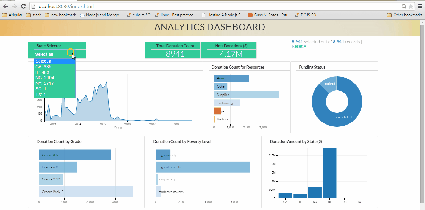
Here’s what the end result will look like (might take a couple seconds to load):

projectnew

STEP 1: Identifying our Analysis

We will be analyzing data from DonorsChoose.org, which is a US based non profit organization that allows individuals to donate money directly to public school classroom projects. We will get the dataset and try to create an informative analysis on the basis of the data attributes. We will have more clarity on this once we actually see the data set. I have taken a subset of the original data set for our analysis purposes. This dataset contains nearly 9000 rows.

Step 2: Fetching the data and storing it in MongoDB

The original dataset from DonorsChoose.org is available here. For our project we will be using a portion of the “Project” dataset. I have chosen this data as i am somewhat familiar with it. The “Project” dataset contains datapoints for the classroom projects data available with DonorsChoose.org. I have intentionally used a small subset of the data so that we can focus on getting the charts done quickly rather than waiting for the data to be fetched each time we refresh. That said, you can always ingest the original dataset once you have mastered this post. To  download the required dataset click here.

Unzip the rar file to your desktop or a suitable directory.

After unzipping the downloaded file, we get a file named sampledata.csv with a size around 3 megabytes.The data is in csv (comma separated value) format. CSV files are a popular option for storing data in a tabular format. CSV files are easy ti interpret and parse. The file contains nearly 9,000 records and 44 attributes which we can use for our analysis.

Lets Install MongoDB. I am using a windows environment but the process is nearly similar on all platforms. The installation manuals can be found here. For the windows environment open your command prompt, Go to the folder where you installed mongodb and locate the bin folder. In my case the path is :

C:\Program Files\MongoDB\Server\3.0\bin>

Fire up your mongoDB by running mongod.exe. Leave the prompt running as it is and open another command prompt and navigate to the bin directory again. Enter this command

C:\Program Files\MongoDB\Server\3.0\bin>mongoimport -d donorschoose -c projects --type csv --headerline --file C:\Users\Anmol\Desktop\sampledata\sampledata.csv

You will see mongodb importing the datapoints from our data set into the database. This process might take some time.

While we are at it, i would strongly recommend using robomongo in case you are going to work with MongoDB on a regular basis. Robomongo is a GUI based mongoDB management tool. Install robomongo and  open it. Create a new connection and enter localhost as the address and 27017 as the password and click save. Connect to this instance in the next screen that you get. The robomongo shell will look something like this:

robomongo

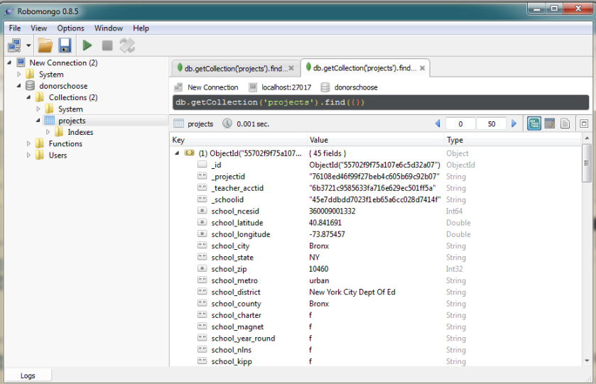
Navigate to the projects collection and double click on it to see a list of the datapoints. Click on the tiny expand arrow on the datapoints list to see the full list of attributes for the document. These are the attributes  (columns) that we just imported from our dataset. We will be using the following attributes for our analysis:

  1. school_state
  2. resource_type
  3. poverty_level
  4. date_posted
  5. total_donations
  6. funding_status
  7. grade_level

Step 3: Setting Up the Node.js Server

Now to the one of the happening server platforms: Node.js or Node JS or Nodejs, point is you cant ignore it!
I am quoting their website here:

Node.js® is a platform built on Chrome’s JavaScript runtime for easily building fast, scalable network applications. Node.js uses an event-driven, non-blocking I/O model that makes it lightweight and efficient, perfect for data-intensive real-time applications that run across distributed devices.

I find Node.js to be very fast and it works really well as far as connecting to mongodb is concerned.

To begin with we need to install Node.js and npm. npm is a package manager for node and helps us in easily deploying modules for added functionality.Here is a cool guide on installing node and npm for windows.

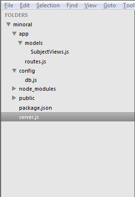
Our Node.js platform is broadly classified into the following folders:

  1. App Folder: Contains the models for data connections and api serving. Includes the files:
    1. SubjectViews.js: holds the data model. Specify specific queries (if any) and the collection name to fetch data from
    2. routes.js: Fetches data from the collection and serves it as an api
  2. Config Folder:
    1. DB.js: Contains the database information i.e. the address and the port to connect to
  3. node_modules folder: Contains various node modules which are installed to enhance functionality of the node server
  4. Public Folder: Will contain our html, javascript and css files. We will use these three to code our charts utilizing the visualization and aggregation libraries.
  5. package.json file: Contains a list of all the modules which need to be installed for the server to run
  6. server.js file: The file utilizes the node modules to initialize data fetch from mongoDB and host our webpages over the network.

The folder structure for our project will look like this:

folderstr

You can copy the full  code and folder structure from the github repository here:

Navigate to the home folder and run npm install command
C:\Users\Anmol\Desktop\blog>npm install

NPM will read the dependencies from the package.json file and install them.

Tip for ubuntu users installing node.js :

To make those Node.js apps that reference “node” functional symbolic link it up:

sudo ln -s /usr/bin/nodejs /usr/bin/node

We now have our folder structure ready. Run this command :
npm start
You will see a message from node saying that the magic is happening on port 8080. (You can change the port number from the server.js file)

Open your browser and go to localhost:8080/api/data (Defined in the routes.js file)

Awesome. Now our API is all set! For the final part i.e. Creating visualizations for the data.

 4. Building our frontend using D3.js,Dc.js and some good old javascript.

A lot of great Business Intelligence (BI) tools exist in the current landscape, Qlik,Spotfire,Tableau,Microstrategy to name a few. Along came D3.js, an awesome open source visualization library which utilized the power of the omnipresent javascript to make charting cool and put the control of the visualization design in user’s hands.

We will be using a responsive html template for our design needs as our main aim is to get the charts up and running rather than code the responsiveness and the style of the various divs. I have used a nice synchronous template for this project.

If you take a look at the node.js code you will observe that the static content will be served in the public folder. Hence we place our html stuff there.

We will be utilizing the following libraries for visualization:

  1. D3.js: Which will render our charts. D3 creates svg based charts which are easily passed into out html blocks
  2. Dc.js: which we will use as a wrapper for D3.js, meaning we dont need to code each and every thing about the charts but just the basic parameters
  3. Crossfilter.js: which is used for exploring large multivariate datasets in the browser. Really great for slicing and dicing data.Enables drill down based analysis
  4. queue.js: An asynchronous helper library for data ingestion involving multiple api’s
  5. Dc.css : Contains the styling directives for our dc charts
  6. Dashboard.js: Will contain the code for our charts and graphs

You can always refer to the code repository for the placement of these libraries. We need to include these libraries in our html page (index.html). Now, To the main task at hand: Coding the charts!

In our Dashboard.js file we have the following :

A queue() function which utilizes the queue library for asynchronous loading. It is helpful when you are trying to get data from multiple API’s for a single analysis. In our current project we don’t need the queue functionality, but its good to have a code than can be reused as per the need. The queue function process that data hosted at the API and inserts it into the apiData Variable.

queue()
.defer(d3.json, "/api/data")
.await(makeGraphs);
function makeGraphs(error, apiData) {

Then we do some basic transformations on our data using the d3 functions. We pass the data inside the apiData variable into our dataSet variable. We then parse the date data type to suit our charting needs and set the data type of total_donations as a number using the + operator.

var dataSet = apiData;
var dateFormat = d3.time.format("%m/%d/%Y");
dataSet.forEach(function(d) {
d.date_posted = dateFormat.parse(d.date_posted);
d.date_posted.setDate(1);
d.total_donations = +d.total_donations;
});

Next Steps are ingesting the data into a crossfilter instance and creating dimensions based on the crossfilter instance. Crossfilter acts as a two way data binding pipeline. Whenever you make a selection on the data, it is automatically applied to other charts as well enabling our drill down functionality.

var ndx = crossfilter(dataSet);


var datePosted = ndx.dimension(function(d) { return d.date_posted; });
var gradeLevel = ndx.dimension(function(d) { return d.grade_level; });
var resourceType = ndx.dimension(function(d) { return d.resource_type; });
var fundingStatus = ndx.dimension(function(d) { return d.funding_status; });
var povertyLevel = ndx.dimension(function(d) { return d.poverty_level; });
var state = ndx.dimension(function(d) { return d.school_state; });
var totalDonations = ndx.dimension(function(d) { return d.total_donations; });

Now we calculate metrics and groups for grouping and counting our data.

var projectsByDate = datePosted.group();
var projectsByGrade = gradeLevel.group();
var projectsByResourceType = resourceType.group();
var projectsByFundingStatus = fundingStatus.group();
var projectsByPovertyLevel = povertyLevel.group();
var stateGroup = state.group();
var all = ndx.groupAll();


//Calculate Groups
var totalDonationsState = state.group().reduceSum(function(d) {
return d.total_donations;
});
var totalDonationsGrade = gradeLevel.group().reduceSum(function(d) {
return d.grade_level;
});
var totalDonationsFundingStatus = fundingStatus.group().reduceSum(function(d) {
return d.funding_status;
});
var netTotalDonations = ndx.groupAll().reduceSum(function(d) {return d.total_donations;});

Now we define the charts using DC.js library. Dc.js makes it easy to code good looking charts. Plus the dc library has a lot of charts to suit majority of anaysis. Checkout the github page for dc here.

var dateChart = dc.lineChart("#date-chart");
var gradeLevelChart = dc.rowChart("#grade-chart");
var resourceTypeChart = dc.rowChart("#resource-chart");
var fundingStatusChart = dc.pieChart("#funding-chart");
var povertyLevelChart = dc.rowChart("#poverty-chart");
var totalProjects = dc.numberDisplay("#total-projects");
var netDonations = dc.numberDisplay("#net-donations");
var stateDonations = dc.barChart("#state-donations");

And the final part where we define our charts. We are using a combination of charts and widgets here. You may notice that we are essentially supplying basic information to the chart definitions like dimension,group, axes properties etc.

// A dropdown widget
selectField = dc.selectMenu('#menuselect')
.dimension(state)
.group(stateGroup);
// Widget for seeing the rows selected and rows available in the dataset
dc.dataCount("#row-selection")
.dimension(ndx)
.group(all);
//A number chart
totalProjects
.formatNumber(d3.format("d"))
.valueAccessor(function(d){return d; })
.group(all);
//Another number chart
netDonations
.formatNumber(d3.format("d"))
.valueAccessor(function(d){return d; })
.group(netTotalDonations)
.formatNumber(d3.format(".3s"));
//A line chart
dateChart
//.width(600)
.height(220)
.margins({top: 10, right: 50, bottom: 30, left: 50})
.dimension(datePosted)
.group(projectsByDate)
.renderArea(true)
.transitionDuration(500)
.x(d3.time.scale().domain([minDate, maxDate]))
.elasticY(true)
.renderHorizontalGridLines(true)
.renderVerticalGridLines(true)
.xAxisLabel("Year")
.yAxis().ticks(6);
//A row chart
resourceTypeChart
//.width(300)
.height(220)
.dimension(resourceType)
.group(projectsByResourceType)
.elasticX(true)
.xAxis().ticks(5);
//Another row chart
povertyLevelChart
//.width(300)
.height(220)
.dimension(povertyLevel)
.group(projectsByPovertyLevel)
.xAxis().ticks(4);
//Another row chart
gradeLevelChart
//.width(300)
.height(220)
.dimension(gradeLevel)
.group(projectsByGrade)
.xAxis().ticks(4);
//A pie chart
fundingStatusChart
.height(220)
//.width(350)
.radius(90)
.innerRadius(40)
.transitionDuration(1000)
.dimension(fundingStatus)
.group(projectsByFundingStatus);
//A bar chart
stateDonations
//.width(800)
.height(220)
.transitionDuration(1000)
.dimension(state)
.group(totalDonationsState)
.margins({top: 10, right: 50, bottom: 30, left: 50})
.centerBar(false)
.gap(5)
.elasticY(true)
.x(d3.scale.ordinal().domain(state))
.xUnits(dc.units.ordinal)
.renderHorizontalGridLines(true)
.renderVerticalGridLines(true)
.ordering(function(d){return d.value;})
.yAxis().tickFormat(d3.format("s"));

And finally we call the dc render function which renders our charts.

dc.renderAll();

Mission Accomplished!

Open your browser and go to localhost:8080/index.html to see your dashboard in action.

There is a lot of customization that can be done to the charts. I did not delve into them at this stage. We can format the axes, the colors, the labels, the titles and a whole lot of things using dc.js, d3.js and CSS. Moving on i will be taking up one chart at a time and provide additional examples of what all we can customize.

At the end we now have some knowledge of MongoDB, Nodejs, D3. You can use this project as a boilerplate for exploring and analysing new data sets. All the source code can be found in this github repository.

I will be most happy to answer your questions and queries.Please leave them in the comments.

Do share the post and spread the good word. It may help folks out there get to speed on this open source visualization stack.

Cheers!